Elude
As the lead designer, I oversaw every aspect of the project, from market research, testing, and wire-framing, to regularly presenting to leadership and delivering final assets for production. This was a 3-week long project that required us to work off of assumptions provided by stakeholders.
Due to time constraints, I went into creating greyscale high-fidelity prototypes. This quickly helped me uncover problems with scale and information hierarchy.
These designs helped me work on quick iterations with the team of engineers and stake holders.
My Roles
User Experience (UX) Designer
User Interface (UI) Designer
Team
5 developers
Project Manager
Product Manager
Post-Search Category Filtering
Research
I examined each question directly by selecting three direct competitors that offer either one or both of Eludes booking services; flight and/or accommodations.
Understanding filtering in the landscape.
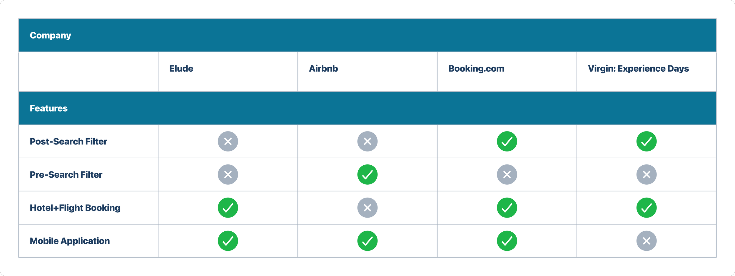
Next, I conducted a competitive analysis to understand three major points —
Where in the user journey are filters most commonly placed?
Do the filters generate flights as well? If so, how is the information displayed?
Are these filters available on mobile? And if so, how are they displayed to the user?
Final Thoughts
Challenges
The most challenging part of this project was its scrappy approach. The project duration was three weeks long, from inception to deployment. There were challenges in managing my own workload, while also delegating work between myself and the other designers meant regular meetings to collaborate and create efficient workflows.
Lessons
I've learned that design isn’t always linear. We had to work diligently to launch the product feature, and it yielded great results for this launching point. We worked quickly and swiftly to put together a finished product while not sacrificing the quality of the work. Team interaction and collaboration were crucial to respond to changing needs.
What’s next?
The team and I created a good launching point but I think we have the opportunity to further iterate on ideas gathered from our research phase. For example, we could work on gathering data collected through this feature to create predictive product behavior for specific user groups.
Source: Think with Google - How Mobile Influences Travel Decision-Making
Findings
Users were most likely to complete trip bookings through a mobile device, so this design approach should be responsive and accessible from all mobile device types.
Post-search filtering is the most common practice.
Horizontal display of filters is best practice when working with a limited data set.
Design
User Persona
How did our existing persona fit into this design feature?
As I mentioned in my last case study, I wanted to encourage the team to circle back to our personas during every product change or feature addition. For this project, we did just that and dove further into what their user needs would be and when they would find the category filter feature most useful.
This also helped us paint a clearer picture of what we wanted the user journey to look like.
Results
After working with the engineers and stakeholders, we decided to pursue the second design option as it was the most cost and time-effective of the two.
Based on technical constraints, choosing when to incorporate the filter options became the most challenging task but ultimately due to the constraints within our API we decided to create a pre-search filter.
Final Design
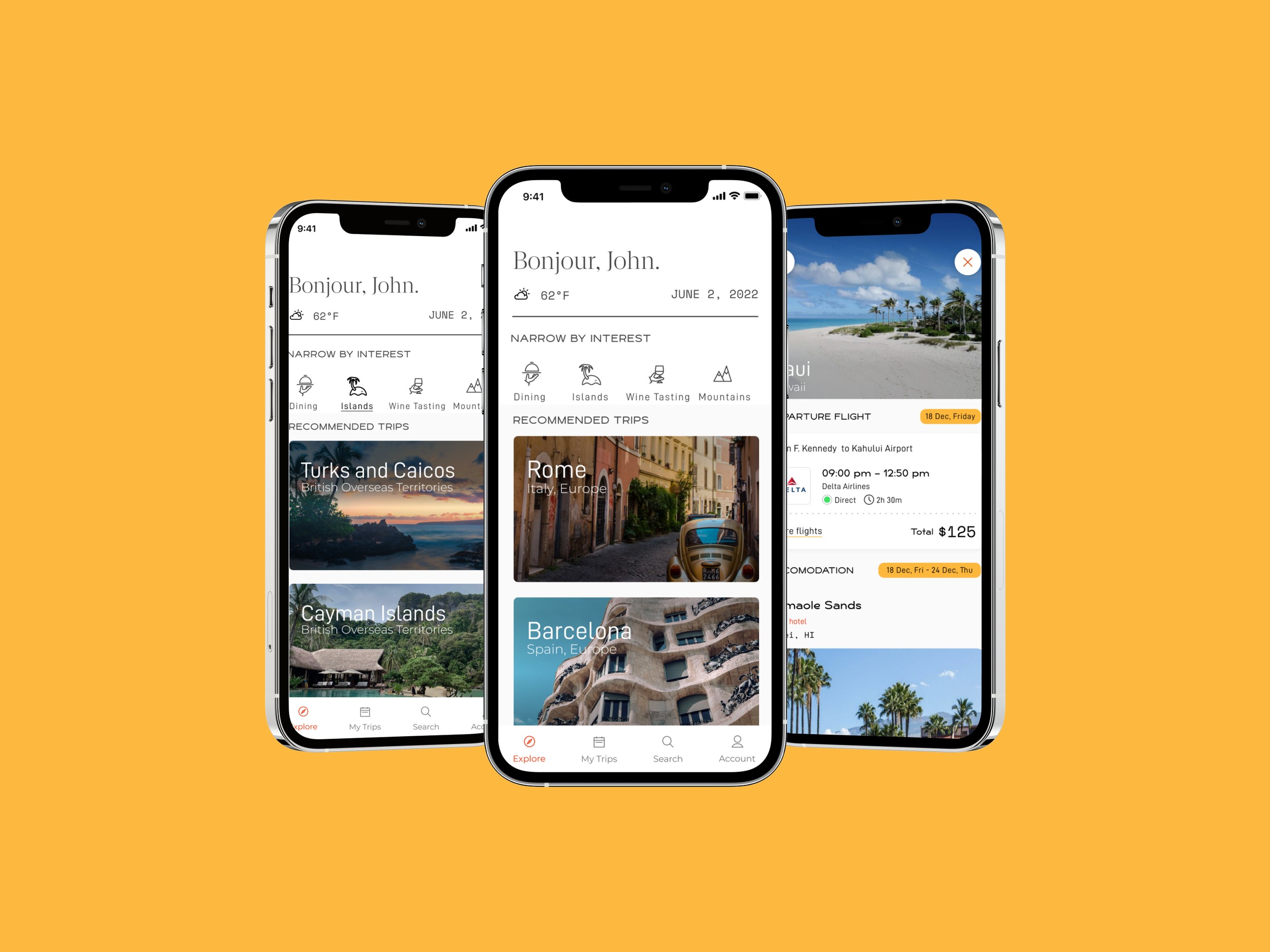
Check out the final prototype to the right
A few targeted outcomes we would be looking to measure success:
Number of clicks per session
Discoverability of filter, are the filters easy to find, and are users interacting with them as we were expecting?
Session duration, as we expect user satisfaction to increase we would expect to see longer duration sessions.
Persona: The Luxury Traveler
Design 1:
This design option allowed users to filter after their initial trip search. After presenting this idea to engineers and product managers, we considered the cost of running multiple searches through our API.
Design 2:
This option allowed users to filter from our explore page.
After meeting with the engineers and product managers, we discussed the accessibility issues that could come from having a side scroll design.
Competitive Analysis
3 weeks
November-December 2022
Timeline
Problem Statement
Stakeholders found that a lot of our users were searching the platform with the goal of booking specific destinations, and attraction types in mind.
Since this was a short-sprint project, I started off the project by defining a brief research plan and setting out initial thoughts on goals, methodologies, and timelines.
Due to the scrappy nature of the project, I focused most of my efforts on secondary research, in hopes of uncovering industry trends and inspiring any potential further studies.
Market Research
I wanted to understand the mental model for a user’s decision-making and to understand if the filter feature was a valid hypothesis. Below are some data points from my research analysis that illustrate vital information as it pertains to travel decision-making:
Hypothesis
When working with a limited amount of filters they should be clearly visible to the user, and the interaction should be frictionless. Users also expect the feature option as a post-search option, as they’ve grown accustomed to on main-stay booking sites.
User Testing
Due to the nature of the project, and the fast-track research, I knew I was working with an assumption. That meant validating our designs through user testing before pushing the design through to implementation was vital.
The users I worked with were familiar with our company branding and product offering so we didn’t lose much insight by working with two-toned design elements.


